When talking about climate change solutions, people have a tendency to be emphatic, yet vague. This worksheet helps clear through the assertions to the eye opening math underneath.
 Posted Jun 10, 2015 by
Rezwan
|
Category :
Contenders •
New Jersey •
Energy Supply •
Scoreboard
We are in the process of designing this worksheet. Your suggestions and graphic help are welcome! The worksheets can be used in a Renewable + Nuclear Living Room Conversation. They will also be a tool for carbon-free coaches in the Zero Carbon Playbook.
Proposal: Start with a baseline infographic that shows the current energy supply breakdown. Follow with a few infographics that walk people through the assumptions of a transition to 1) a 100% Renewable solution; 2) a 100% nuclear solution. These sheets have space for participants to jot down the barriers they would face to adopting these goals, as well as the footprint of these goals. The final part of the “worksheet” is the last page which has a blank “energy supply field”. Participants (a mix of pro 100% renewables and pro nuclear) negotiate to fill up the chart. Share your results online!
Let’s start with an infographic that shows our State’s current energy consumption by energy type. We’ll use my home state of New Jersey as the example.
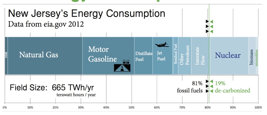
Here is the present energy breakdown for the state of New Jersey. The data is from EIA.gov.

Step one in the worksheet, discuss the graph. What does it tell you?
A second infographic will be derived from the Solutions Project. You can see their New Jersey infographic here. It is given in percents, so we will have to convert that into the Solutions playing field. The Solutions field for NJ will be 43% shorter, because running things on electricity turns out to be more efficient than on fuel. This field shortening advantage applies to nuclear too.
43% shorter is 57% of 665TWh = 379TWh of energy each year. Now, what is the field breakdown? Looking at the Solutions Project poster we start plotting the energy sources. 27.3% from Solar PV plants. 103TWh from Solar PV.
The third part of the worksheet will translate the numbers into spatial dimensions using David MacKay’s reality checks, or other approach the parties agree on. For example, for the Solar PV, how many parks and of what size would you need to supply the 103TWh per year? Using actual capacity factor, not nameplate? Got that number? Great! Now where in the state will you be putting these parks? How do the residents feel about that?
We may have a lot of these calculations already done for the participants, and they can, of course, check the math.
We will also have a 100% nuclear solution. Quick NJ calculation here - if 4 power plants presently supply 17% of New Jersey’s energy, and we’re going to go to a 57% field, 57/16=3.5 times more power plants would be 100%. That’s 14 power plants, so 10 new ones. How much space would they take up? Where would you put them? How will the residents feel about that? 😊
With this data laid out before us, like coaches at a football game, we get to talk about how to deploy the players (power plants and sources) on the field (our State), and consider the opposition to each move - NIMBY, cost, industry lobbying etc.
These are the decisions we’re asking our fellow citizens to make. This simulation should be revealing.
Footprint to Wings is ad-free and has taken thousands of hours to research and write, and thousands of dollars to sustain. If you find any joy and value in it, if you want this platform to be the best it can to help you take your state to net zero carbon, please consider becoming a Member and supporting with a recurring monthly donation of your choosing →
™ & © Footprint to Wings Inc and its Licensors, except where noted. Powered by InterServer.


